
Ribash Karki
Data Analyst | Data Specialist | Data Visualization
Excel | SQL | Tableau | Python
Projects
Python
Finance Data Analysis
Analysis of US big bank sector stock before, during, and after the Great Recession.
Python

9-11 Call Analysis
Exploratory data analysis of 9-11 calls using seaborn, pandas,numpy and matplotlib.
Tableau
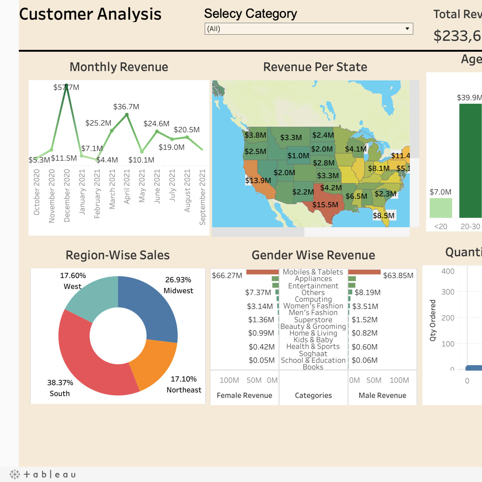
Customer Analysis Dashboard
Dynamic analysis of customer by region, state, monthly revenue, gender wise.
Tableau
HR Analysis Dashboard
Analysis of employees attrition based on age, gender.
SQL
HR Report Analysis/ Testing
Testing reports and KPI
of tableau using SQL queries.

SQL
Music Database Analysis
Queries to answer data-driven decision-making in the dynamic music industry.
Excel
Road Acident Dashboard
Interactice road accident dashboard for year 2021 and 2022.

Excel
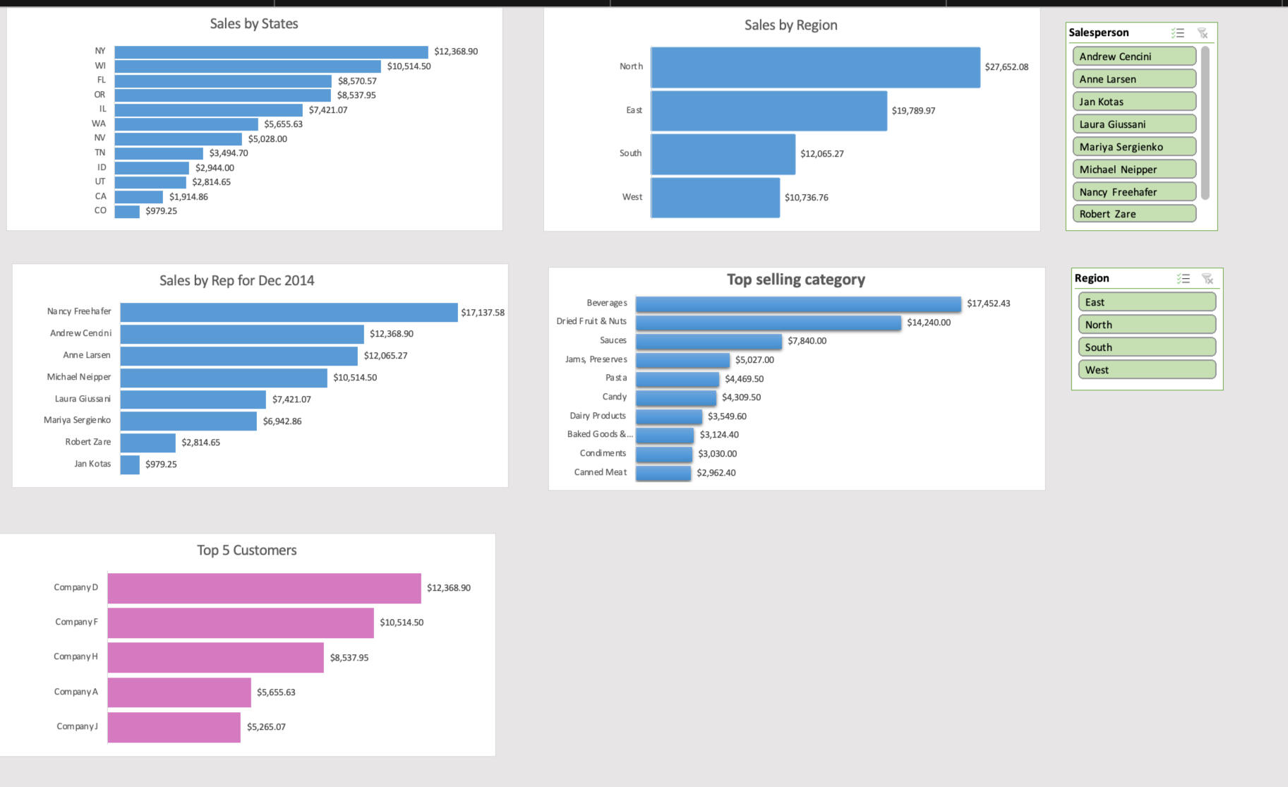
Sales Analysis Dashboard
Dynamic analysis of sales by region, state, product, custoter and category.
Python
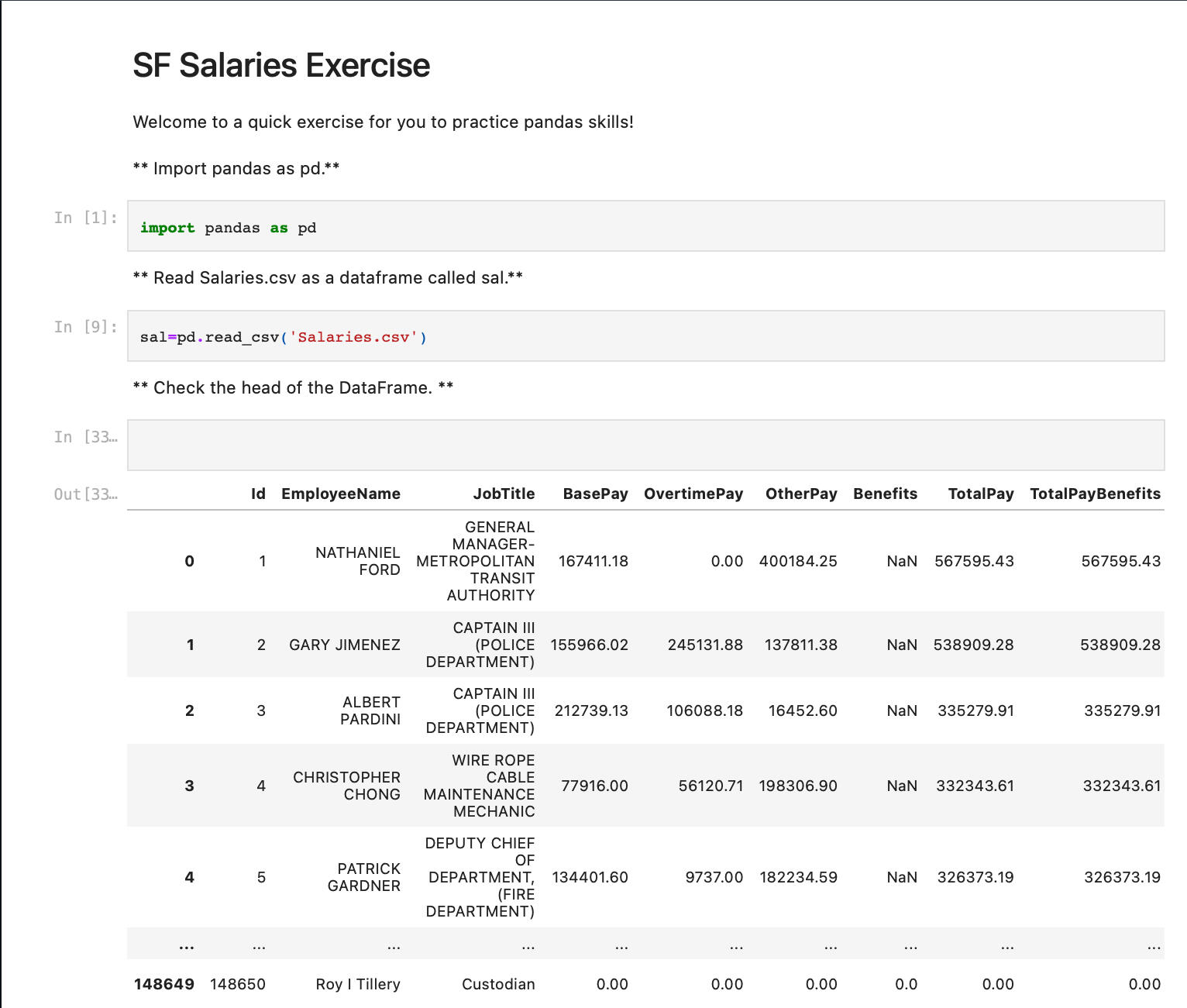
Salary Analysis
In-depth analysis of salary data using Python pandas library.
Python
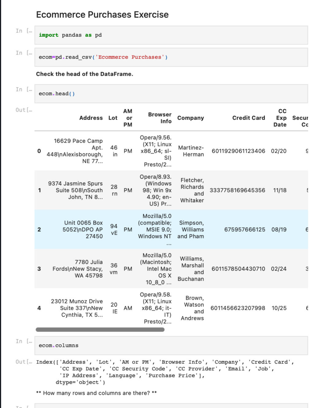
**E-Commerce Data Analysis **
Analysis of E-commerce data using python pandas library,
CERTIFICATIONS

Degree

SQL Essential Training
Excel for Business Analysts

Customer Service: Problem Solving and Troubleshooting
Contact Me
Thanks!
I appreciate you taking the time to visit my portfolio!
© 2022 Ribash Karki. All rights reserved.
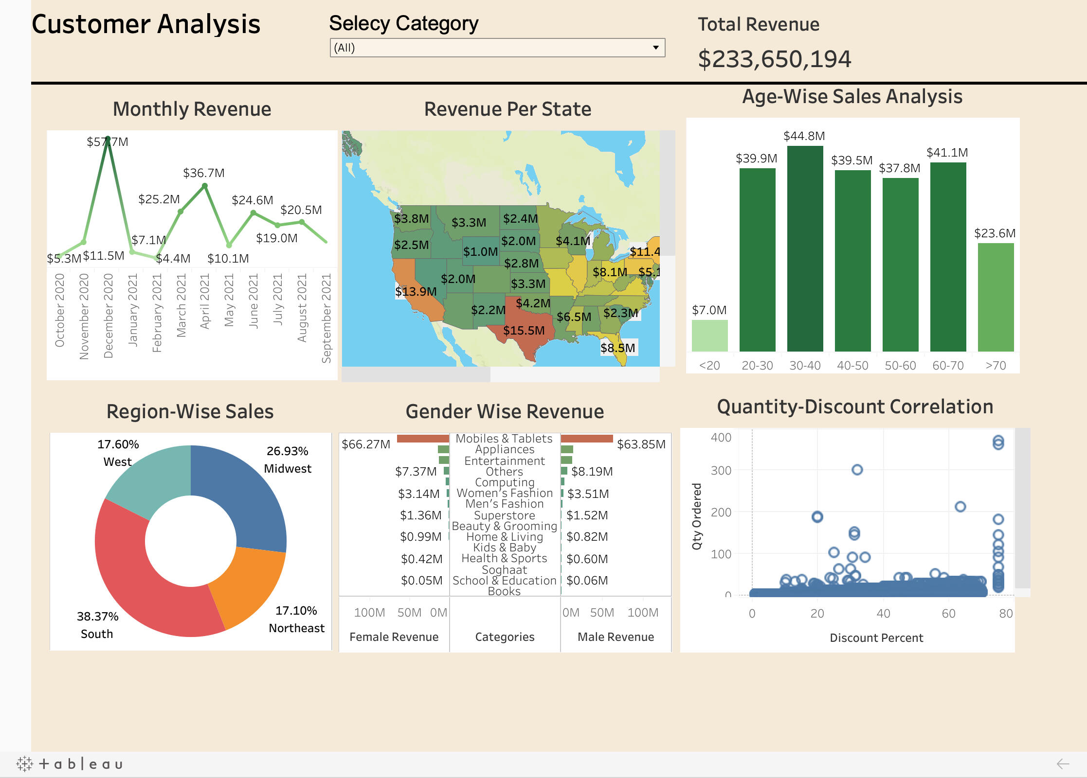
A Tableau customer analysis project is a data-driven initiative that uses the Tableau platform to analyze and visualize customer data. This project can provide insights into customer behavior, preferences, and patterns, which can help businesses improve their marketing and customer service strategies.The project typically involves several stages, including data collection, data cleaning, data analysis, and visualization. Here is a brief description of each stage:1. Data collection: This stage involves gathering data from various sources such as customer databases, sales records, and social media platforms. The data collected may include demographic information, purchase history, customer feedback, and other relevant data.2. Data cleaning: This stage involves removing any duplicate or irrelevant data and ensuring that the data is accurate and consistent. This may involve using tools such as Excel or Python to clean and prepare the data for analysis.3. Data analysis: This stage involves using Tableau to analyze the data and identify patterns and trends. This may include creating calculations, building models, and performing statistical analysis.4. Visualization: This stage involves creating interactive and visually appealing dashboards and reports using Tableau. The visualizations can help businesses understand customer behavior and preferences and identify opportunities for growth.
Some of the key metrics and analyses that are included in this Tableau customer analysis project are:
- Revenue Per State
- Monthly Revenue
- Age Wise Analysis
- Region Wise Sale
- Gender Wise Sale
Overall, a Tableau customer analysis project can provide valuable insights into customer behavior and preferences, helping businesses improve their marketing and customer service strategies and drive growth.
The dashboard is completely dynamic and adjusts depending on the filter that you choose.
Here is a short demo of the project.
You can click the link below to view the project.
CONTACT ME
© Untitled. All rights reserved.
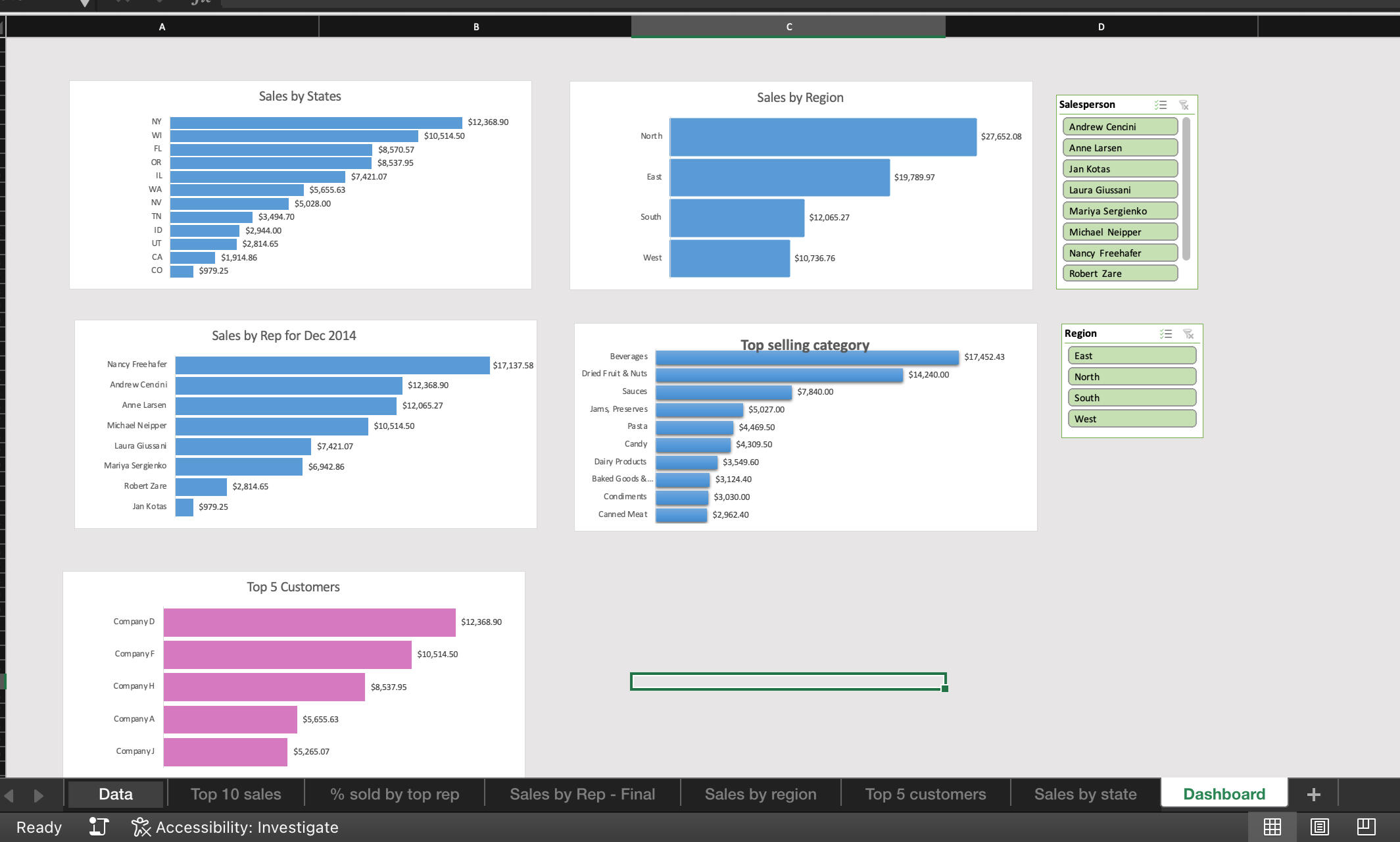
The key features of this Excel sales analysis dashboard include:- Sales Overview: This section provides a snapshot of the overall sales performance, including revenue, sales growth, and other key metrics.- Sales by Product/Service: This section provides an analysis of sales by product or service, highlighting top-selling items and identifying areas of opportunity.- Sales by Region and State: This section provides an analysis of sales by geographic region, helping businesses identify areas with the highest sales potential.- Sales by Customer: This section provides an analysis of sales by customer, allowing businesses to identify their most valuable customers and focus their sales efforts accordingly.- Top Sales by Customer Representative: This section provides an analysis of sales by Sales Representative helping businesses to identify their top sales person and rewarding their hardworks.
I utilized the following skills to create this dashboard:
- Slicer
- Pivot Charts
- Pivot tables
- Sorting
- Filtering
The dashboard is completely dynamic and adjusts depending on the multiple filter.
Here is a short demo of the project.
You can click on the picture above or click the link below to view the project.
CONTACT ME
© Untitled. All rights reserved.
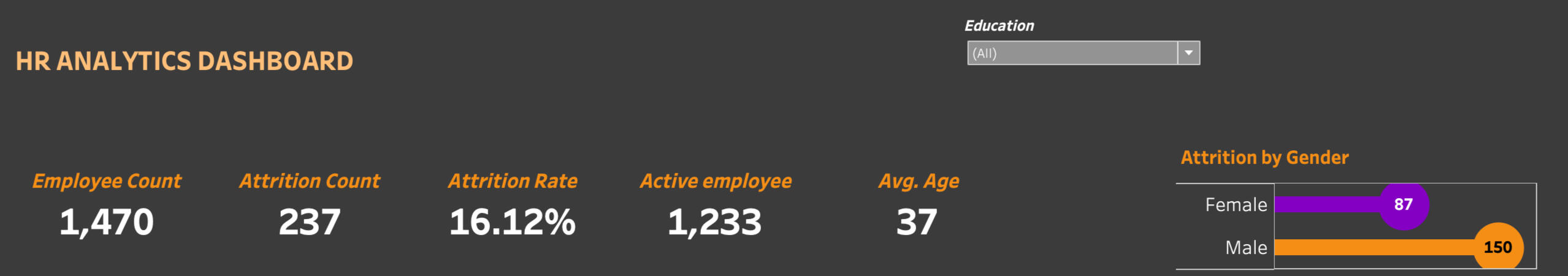
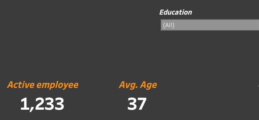
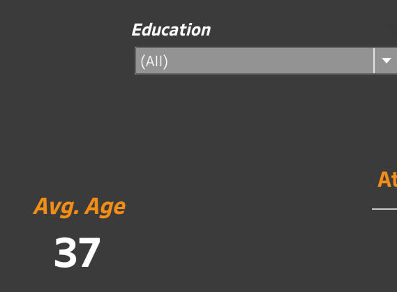
HR analysis project
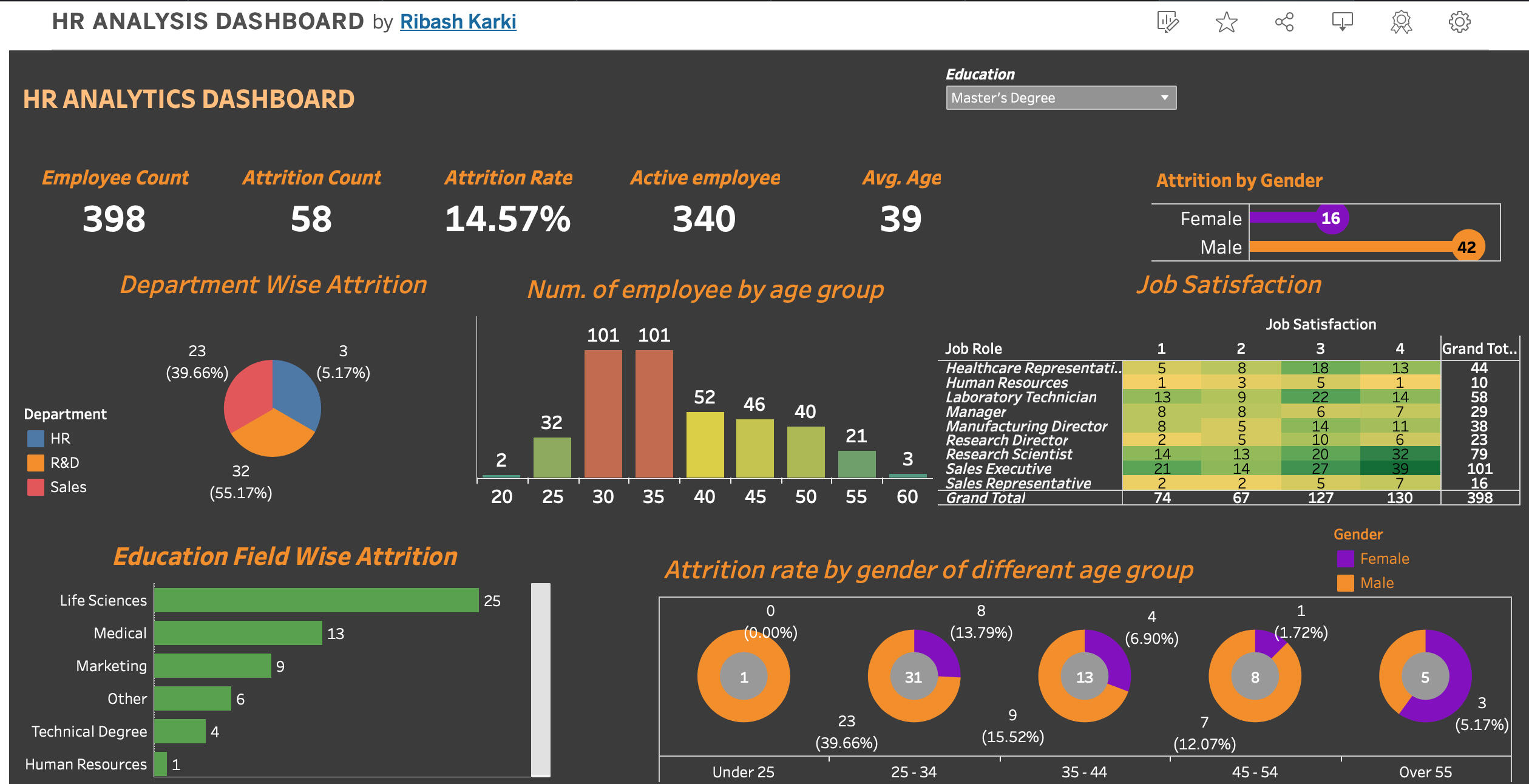
An HR attrition dashboard in Tableau is a visual representation of key metrics related to employee turnover and attrition within an organization. It provides HR professionals and stakeholders with insights into the reasons behind employee departures, identifies patterns, and helps in developing strategies to mitigate attrition. The dashboard includes visualizations, filters, and interactive elements to facilitate data exploration and analysis.
Here are some key insights :
- The age range of 25-35 exhibit higher attrition rates compared to other age groups.
- Male employees have almost twice attrition rate compared to female employees.
- The R&D department have the highest attrition rate almost 1/3 of people are leaving in that department compared to other.
I utilized the following skills to create this dashboard:
- Parameters
- Calculated fields
- KPI
- Custom Charts
The dashboard is completely dynamic and adjusts depending on the filter that you choose.
Here is a short demo of the project.
You can click the link below to view the project in Tableau Public.
CONTACT ME
© Untitled. All rights reserved.
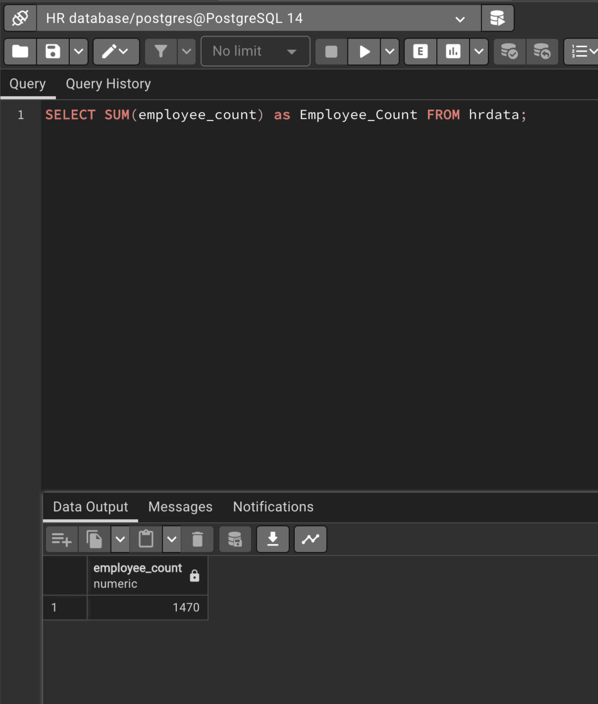
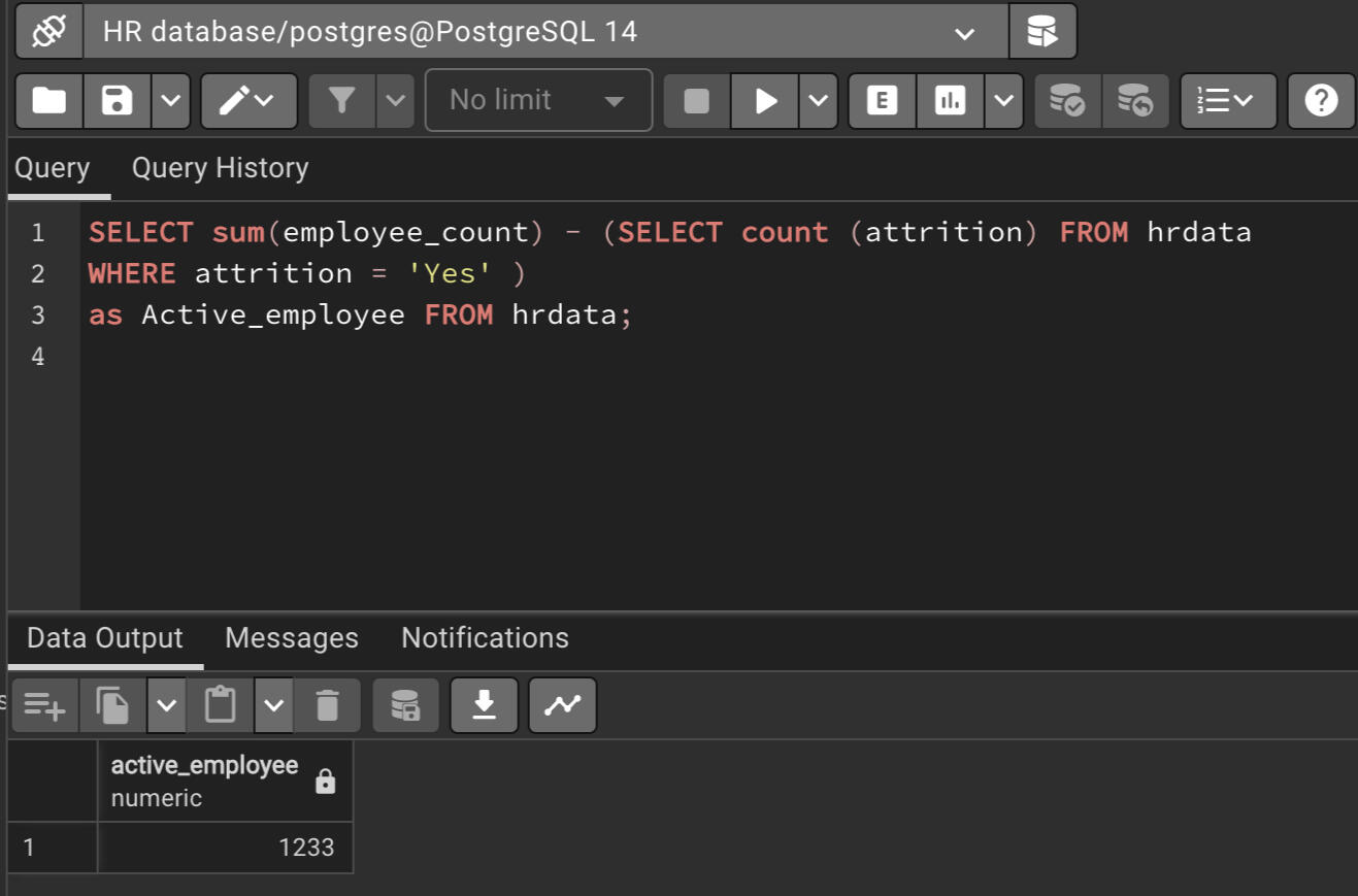
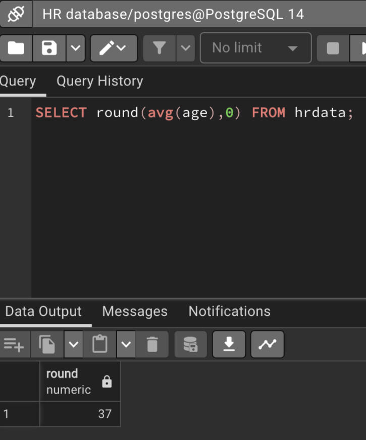
Testing reports and KPI of tableau using SQL queries.
In this project I tested the accuracy of HR analysis. I tested most of the KPI using the SQL queries and tableau side by side.

The SQL skills demonstrated in the projects are:
1. Create
2. Order by
3. Group by
4. Sum
5. Count
6. Round
7. Average
8. Cast
Creating the table
Employee Count
Tableau Report
SQL Query
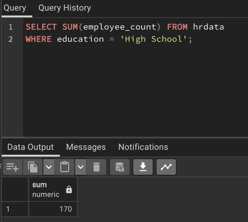
Employee Count by 'High School' education
Tableau Report
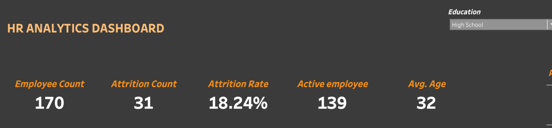
SQL Query
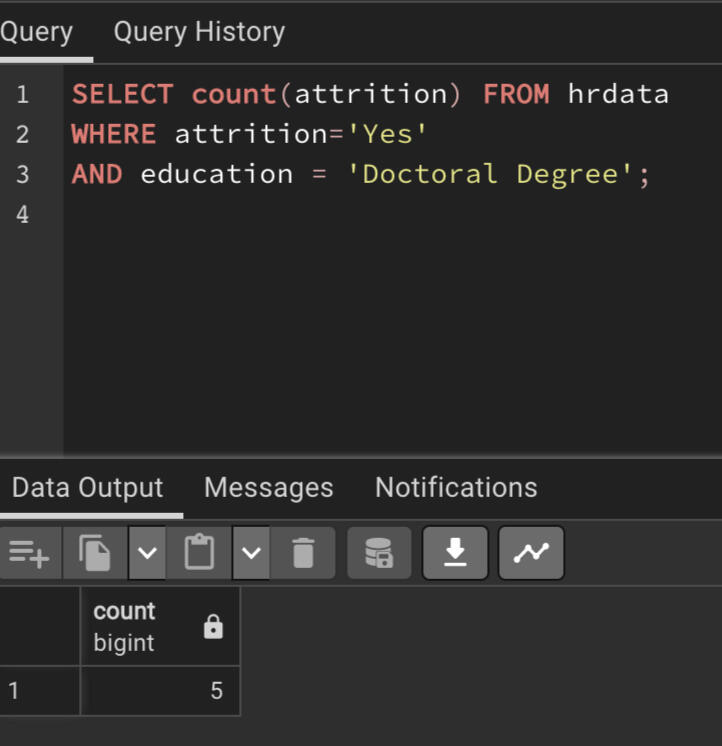
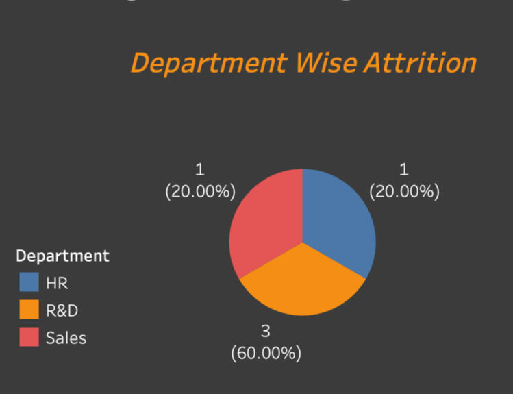
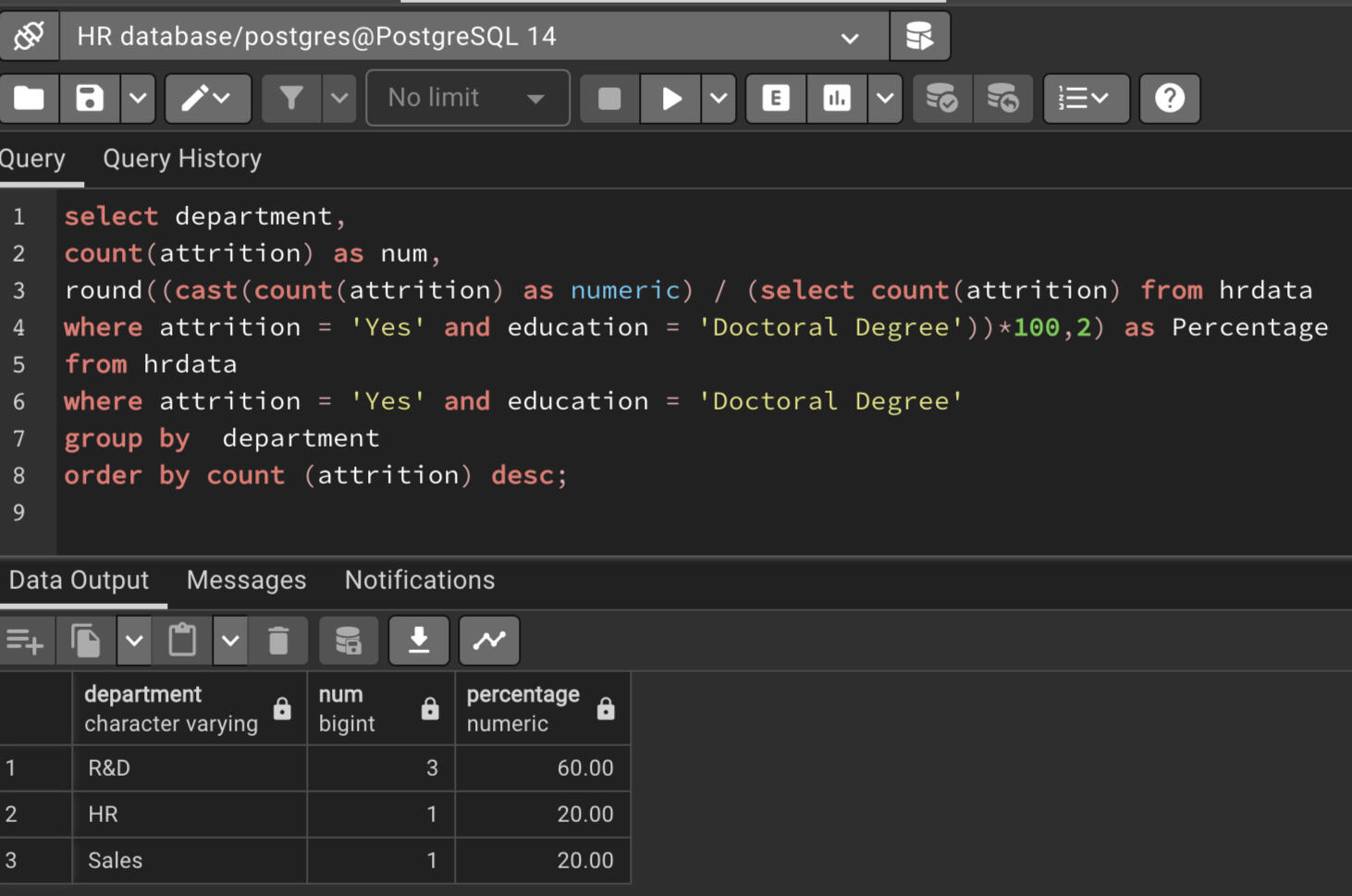
Attrition count by 'Doctoral Degree' education
Tableau Report
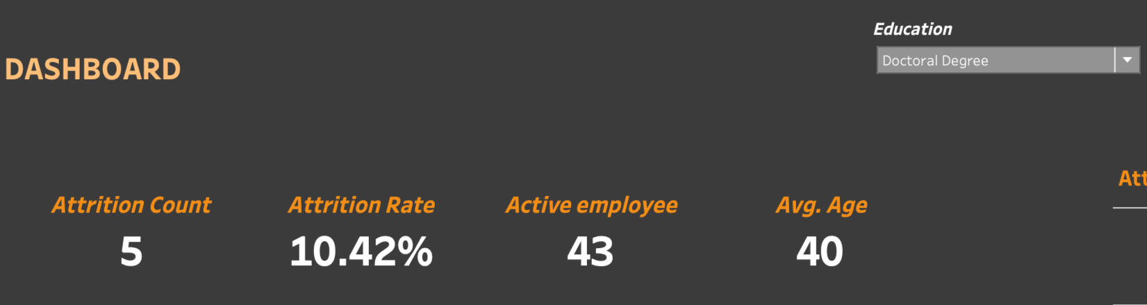
SQL Query
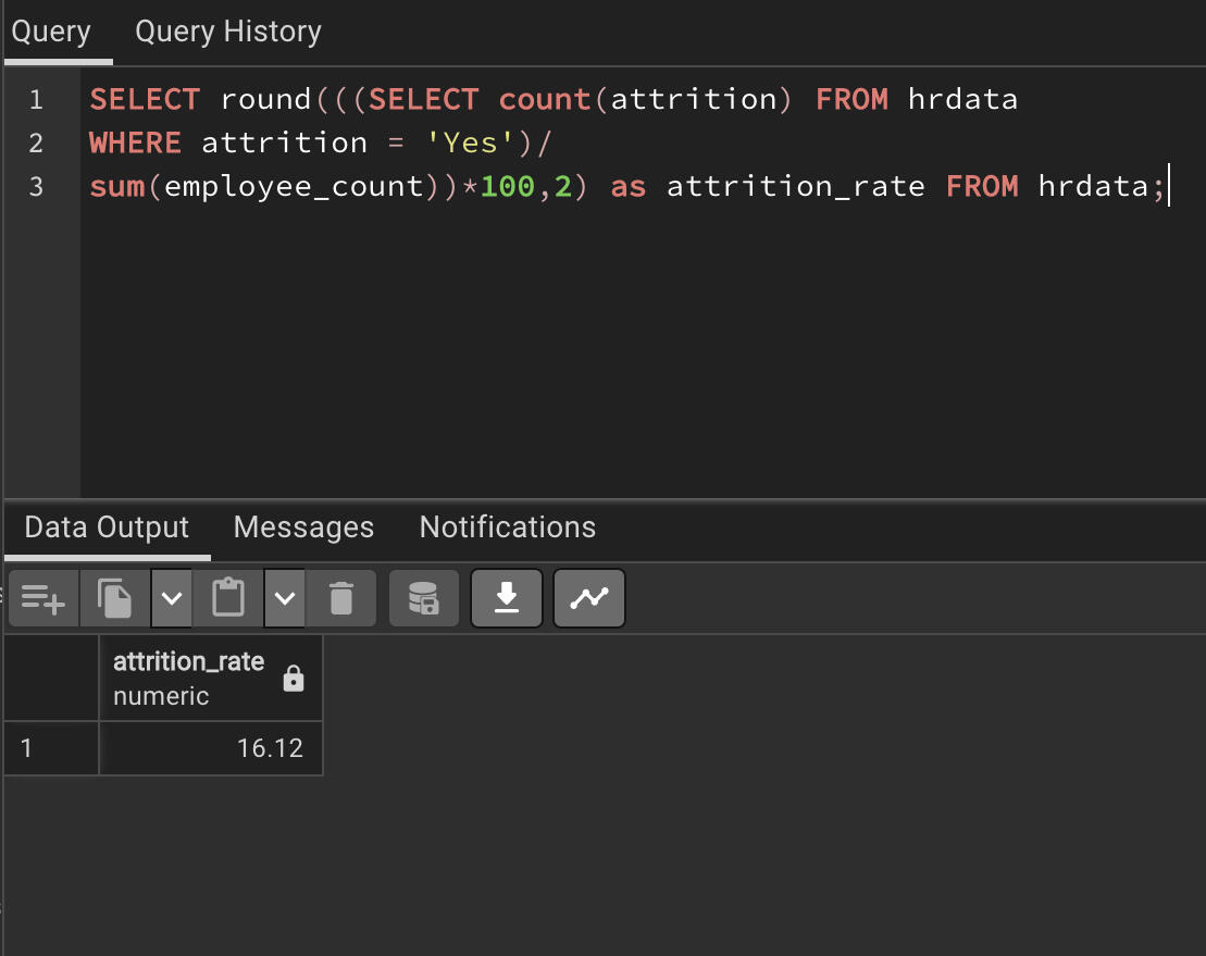
Attrition rate in percentage
Tableau Report
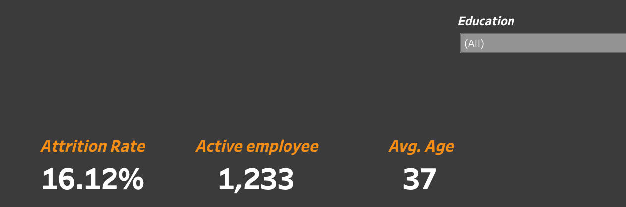
SQL Query
Active Employee Count
Tableau Report
SQL Query
Average attrition age
Tableau Report
SQL Query
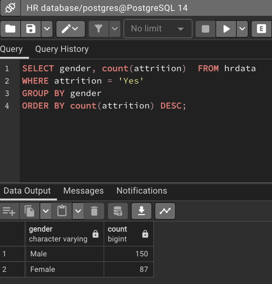
Attrition by Gender
Tableau Report
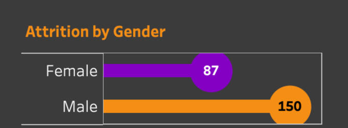
SQL Query
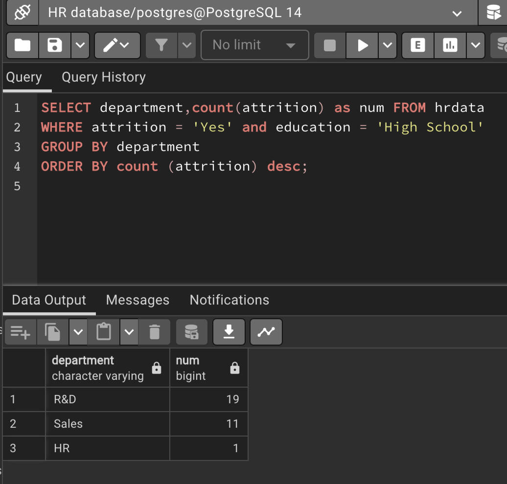
Attrition by Department with filter 'High School' education
Tableau Report
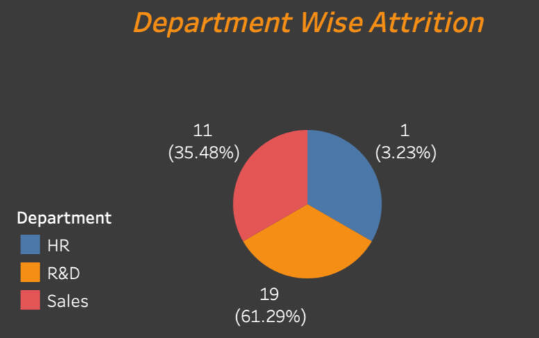
SQL Query
Attrition Department Percentage with filter 'Doctoral Degreel' education
Tableau Report
SQL Query
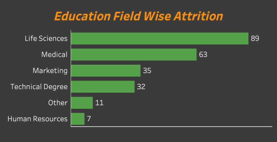
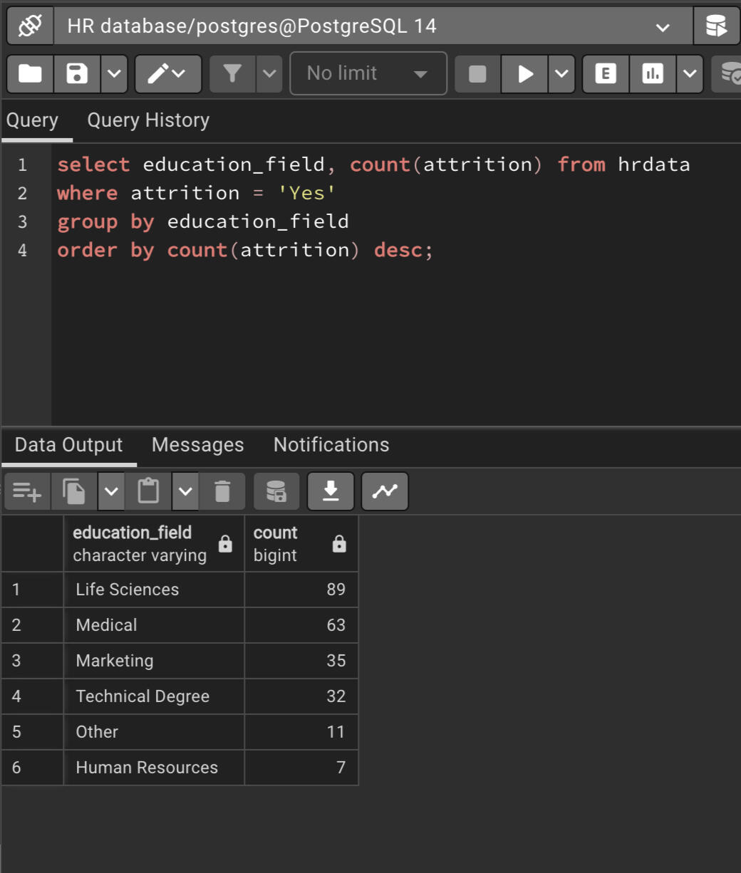
Education field wise attrition
Tableau Report
SQL Query
You can click the link below to view the project.
CONTACT ME
© Untitled. All rights reserved.
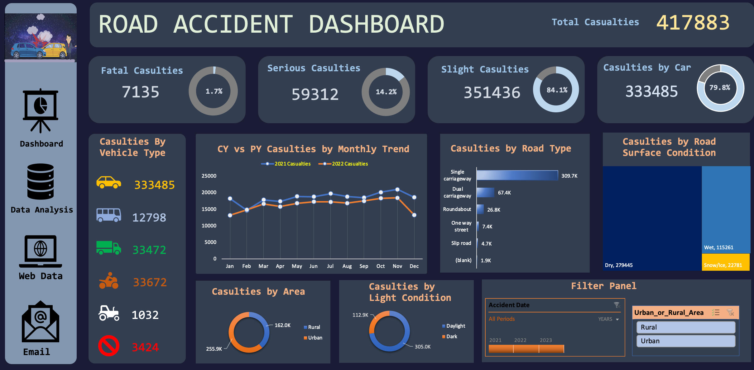
This is a Road Accident Excel Dashboard Project for year 2021 and 2022. Clients want this dashboard so they can have insights on below requirements:- Primary KPI: Total Casualties taken place in the accident.
- Primary KPI: Casualties and total percent of casulties based on the accident severity.
- Secondary KPI: Total Casulties respect to vehichle type.
- Monthly trend based on current year and previous year.
- Maximum Casulties based on road type.
- Maximum casulties respect to road surface.
- Casulties based on area/location.
- Casulties based on daytime/nighttime.
Stakeholders:
- Public
- Police Department
- Ministry of Transport
- Road transport Department
- Road Safety Department
- Emergency Service Department
- Traffic Management
- Transport Operators
- Media
The dashboard is completely dynamic and adjusts depending on the years, area selected via the slicer.
Here is a short demo of the project.
The process and skills involved to create this dashboard are.
- Data Cleaning
- Data Processing
- Data Analysing
- Data Visualization
- Dashboard Building
You can click on the picture above or click the link below to view the project in your device.
CONTACT ME
© 2022 Ribash Karki. All rights reserved.
SQL QUERIES TO ANSWER MUSIC RELATED DATABASE
The project's insights help music industry professionals make smart decisions based on data. By analyzing information about user preferences, trends, and patterns, they can choose which artists to collaborate with, create personalized recommendations, target specific audiences, and curate track and playlist.

The SQL skills demonstrated in the projects are:
1. Common Table Expression (CTE)
2. Join multiple tables
3. Sub Queries
4. Order by
5. Group by
6.Limit
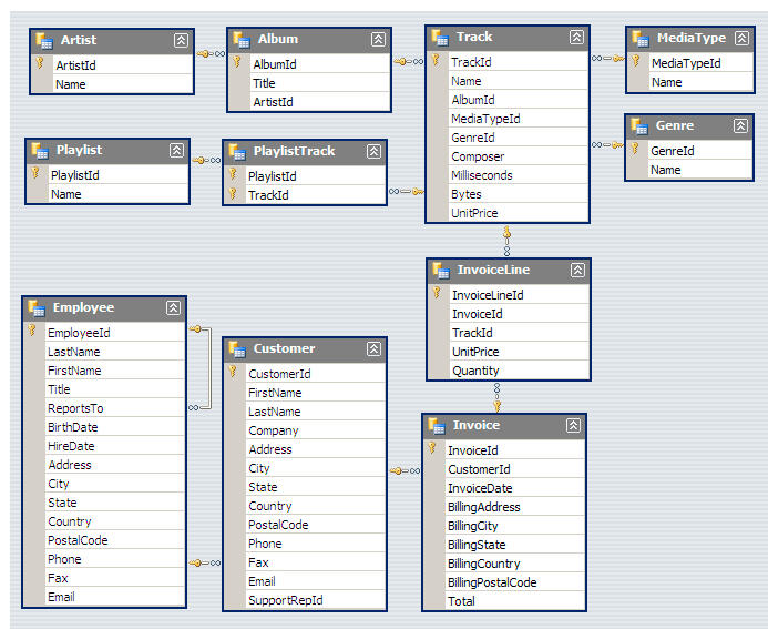
Scheme:
SQL QUESTIONS AND THEIR QUERIES
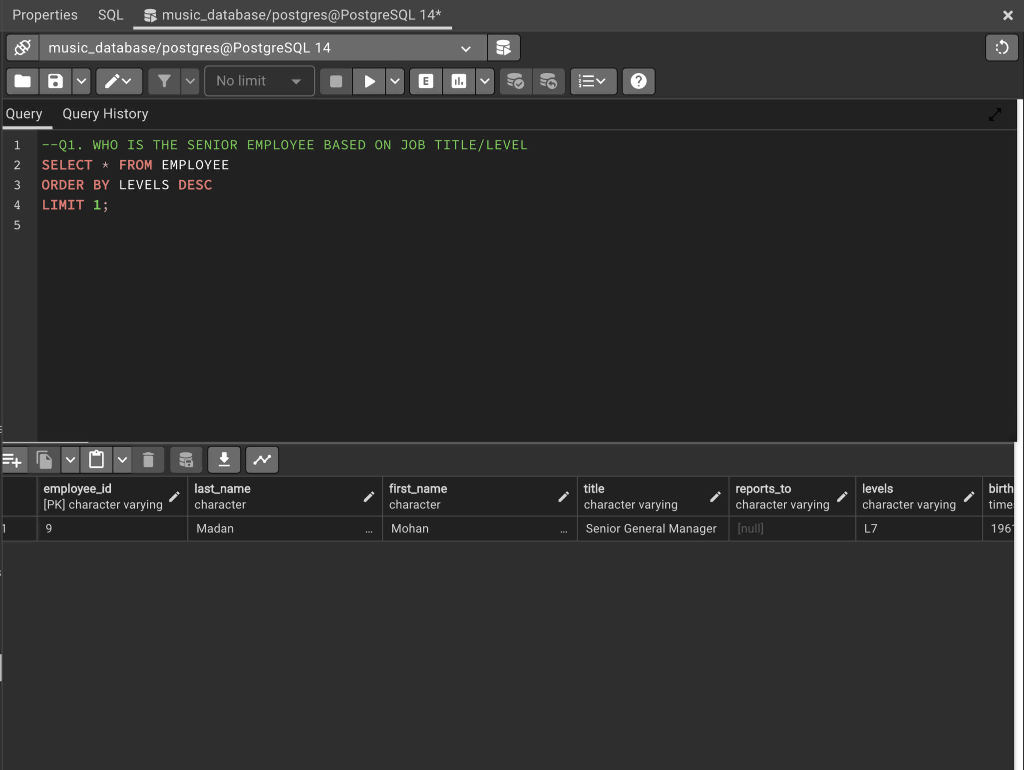
Q1. WHO IS THE SENIOR EMPLOYEE BASED ON JOB TITLE/LEVEL
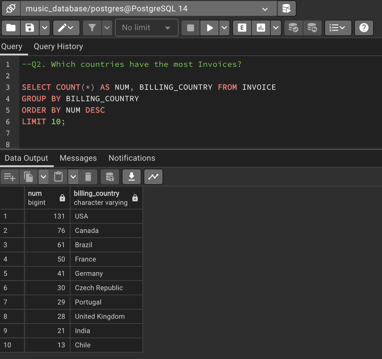
Q2. Which countries have the most Invoices?
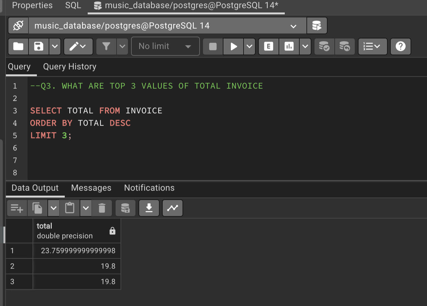
Q3. WHAT ARE TOP 3 VALUES OF TOTAL INVOICE
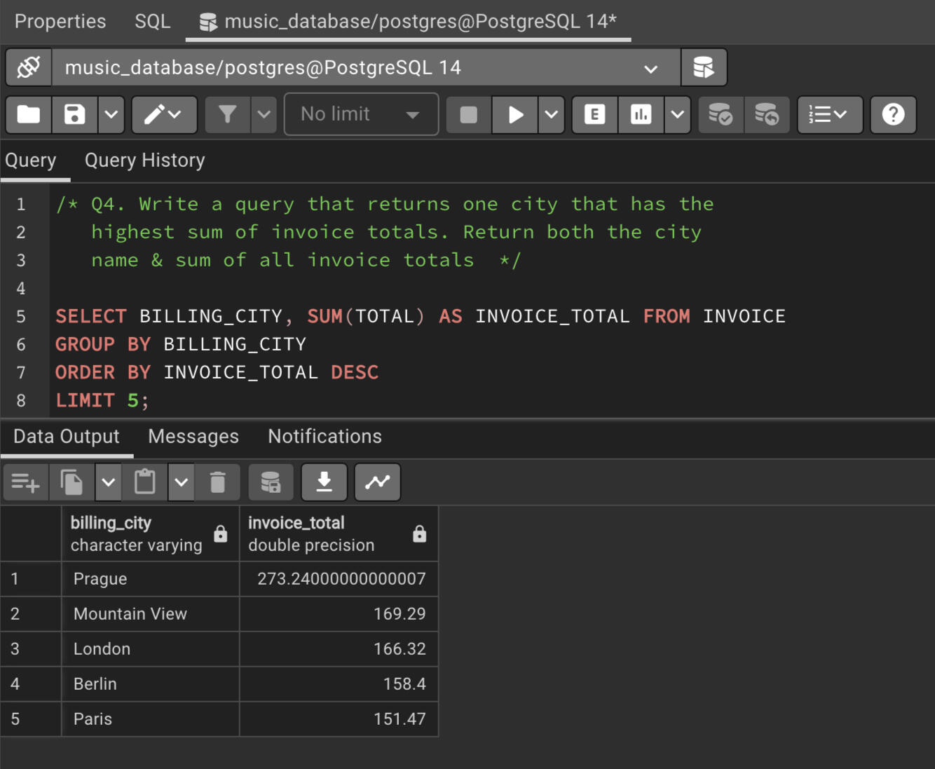
Q4. Write a query that returns one city that has the highest sum of invoice totals. Return both the city name & sum of all invoice totals.
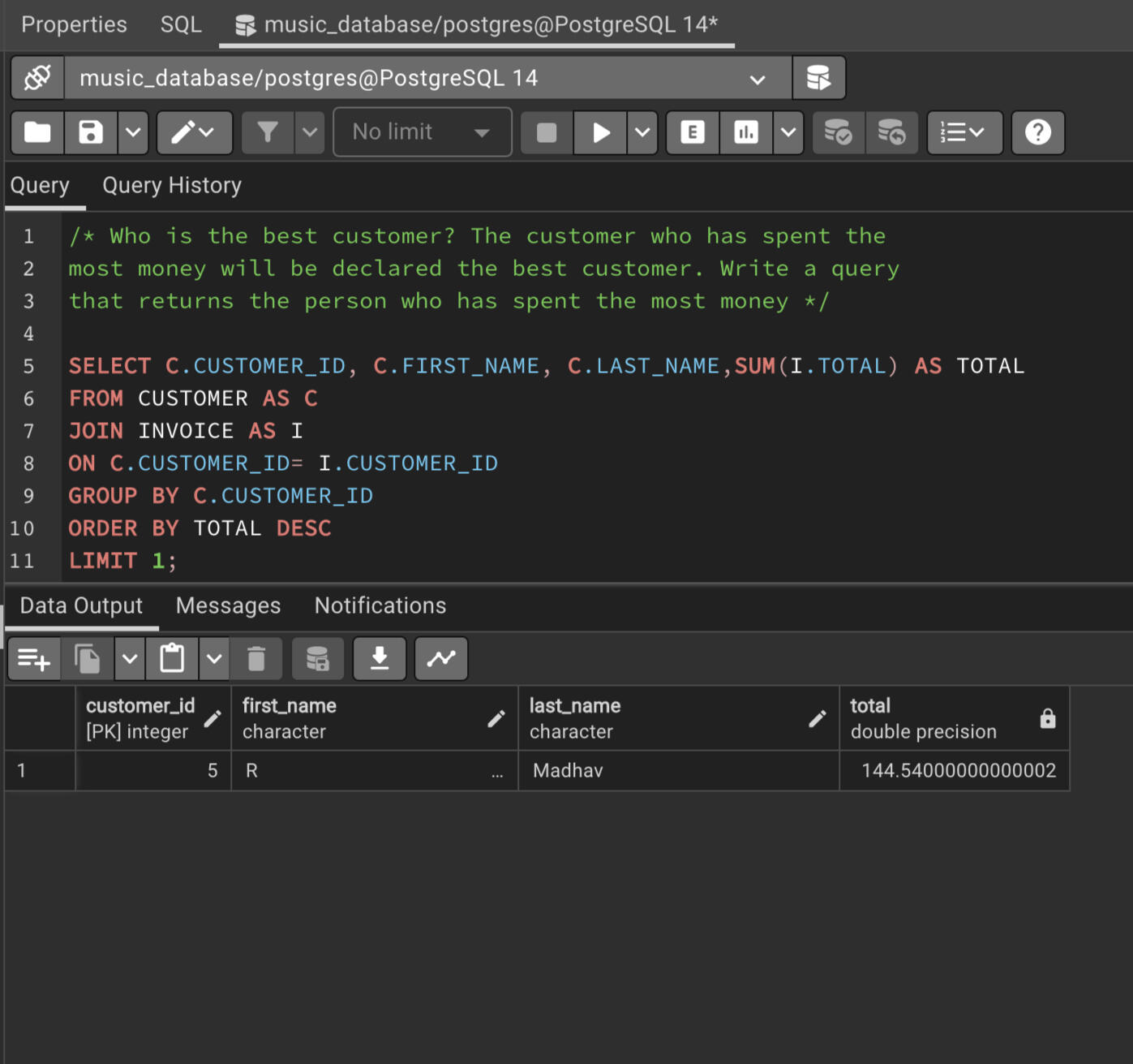
Q5. Who is the best customer? The customer who has spent the most money will be declared the best customer. Write a query that returns the person who has spent the most money.
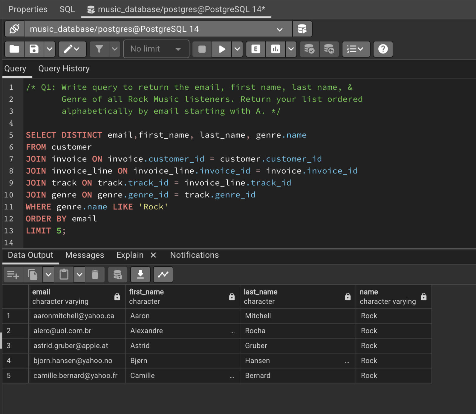
Q6. Write query to return the email, first name, last name, & Genre of all Rock Music listeners. Return your list ordered alphabetically by email starting with A.
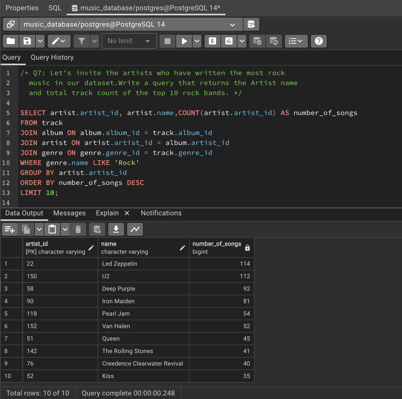
Q7. Let's invite the artists who have written the most rock music in our dataset.Write a query that returns the Artist name and total track count of the top 10 rock bands.
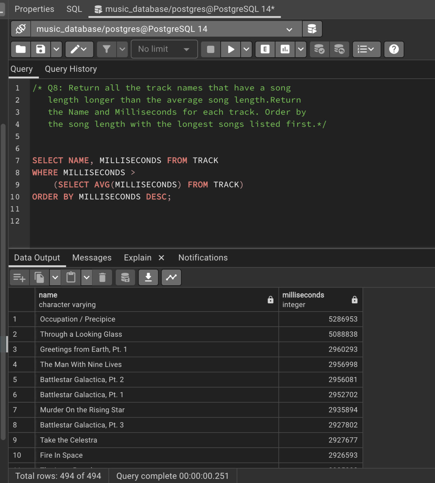
Q8. Return all the track names that have a song length longer than the average song length. Return the Name and Milliseconds for each track. Order by the song length with the longest songs listed first.
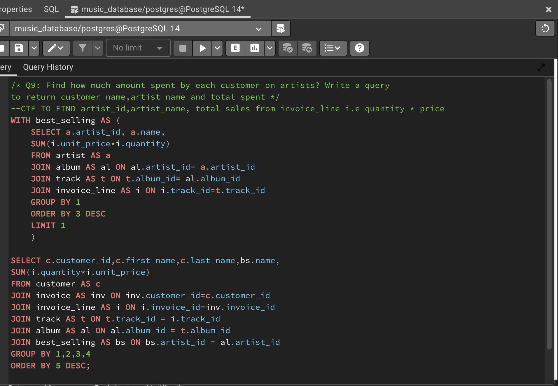
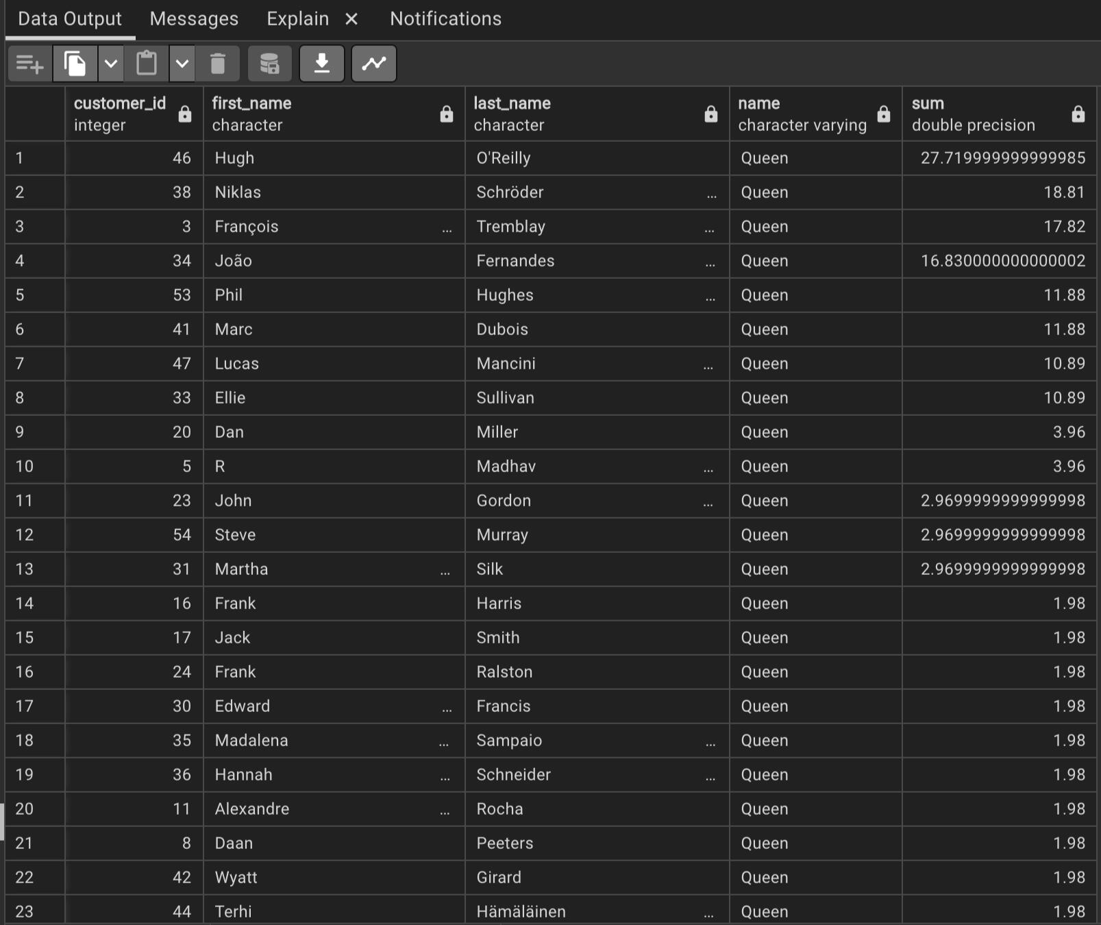
Q9. Find how much amount spent by each customer on artists? Write a query to return customer name,artist name and total spent.
You can click the link below to view the project.
CONTACT ME
© 2022 Ribash Karki. All rights reserved.
In this project, I utilized Python's powerful data manipulation and analysis library, Pandas, to perform an in-depth analysis of salary data. The goal was to extract meaningful insights and trends from the dataset, enabling informed decision-making and providing valuable information for stakeholders.
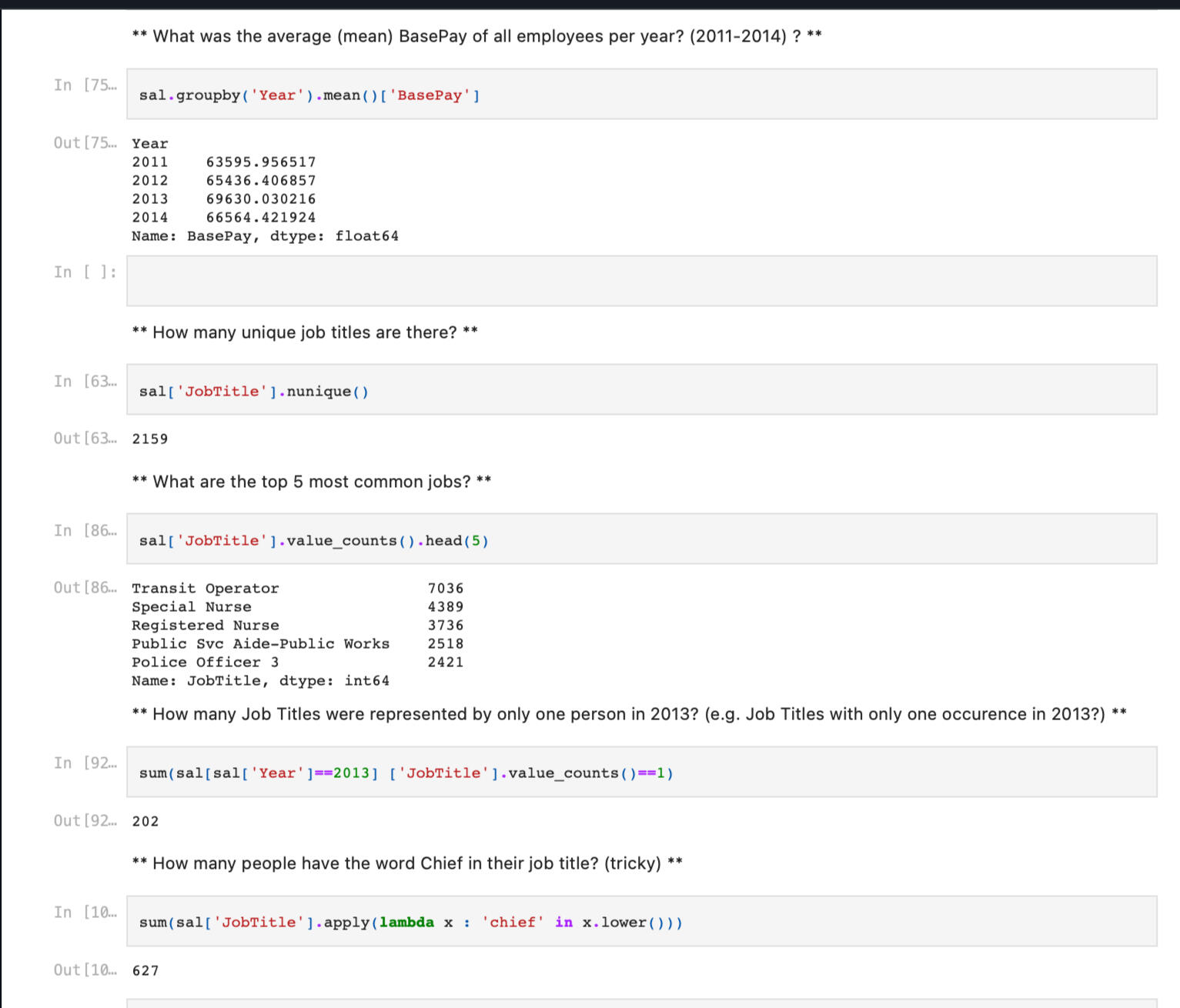
Key steps and highlights of the project included :1. Data Acquisition: Obtained the salary dataset from reliable sources or internal databases, ensuring data integrity and quality.
2. Data Cleaning and Preprocessing: Employed Pandas functionalities to clean and preprocess the data. This involved handling missing values, removing duplicates, standardizing formats, and resolving inconsistencies in the dataset.
3. Exploratory Data Analysis (EDA): Conducted thorough exploratory analysis using Pandas to gain a comprehensive understanding of the dataset.
4.Grouping and Aggregation: Utilized Pandas' grouping and aggregation functionalities to perform analyses at different levels, such as analyzing salaries by department, position, or experience level. Aggregated metrics such as average salary, maximum salary, and minimum salary were computed to identify patterns and disparities.
By leveraging the power of Python's Pandas library, this project successfully enabled the analysis and interpretation of salary data. The outcomes provided valuable insights that supported decision-making processes and facilitated a deeper understanding of salary structures within the organization or industry.
You can click the link below to view the project.
CONTACT ME
© 2022 Ribash Karki. All rights reserved.

Please click on the above picture to see the Credentials.

Please click on the above picture to check the Credentials of the degree.

Please click on the above picture to see the Credentials.

Please click on the above picture to see the Credentials.
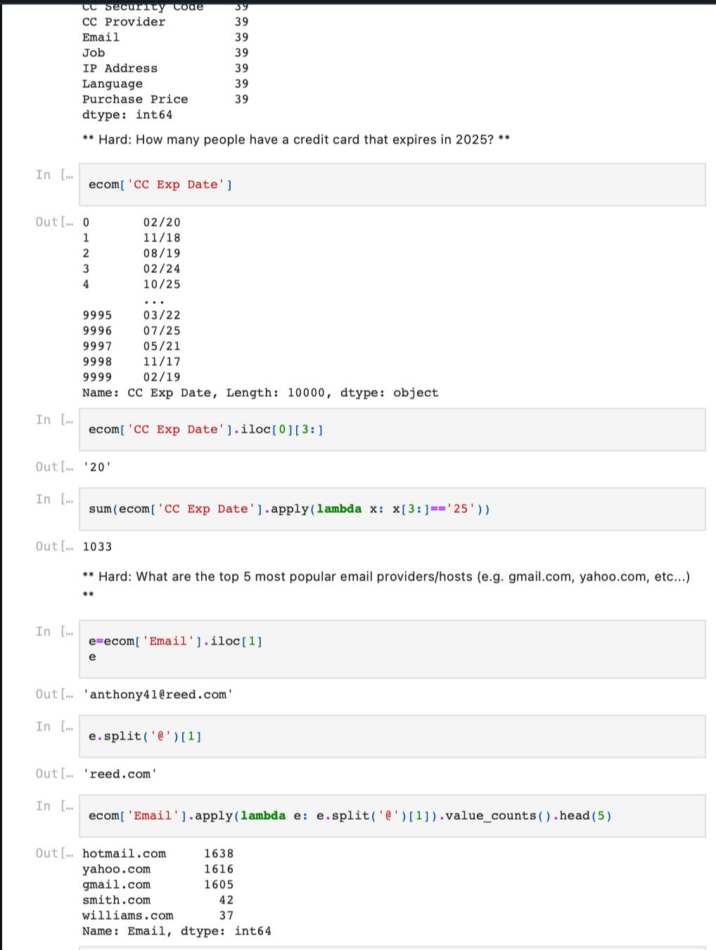
By leveraging Pandas for e-commerce purchase analysis, this project provided valuable insights into customer buying behavior, product preferences, and overall purchase patterns. The derived insights empowered businesses to optimize marketing strategies, enhance customer experiences, and drive revenue growth in the e-commerce domain.
Key steps and highlights of the project included:1.Data Acquisition
2.Data Cleaning and Preprocessing
3.Exploratory Data Analysis (EDA)
4.Product Analysis
5. Reporting Findings
You can click the link below to view the project.
CONTACT ME
© 2022 Ribash Karki. All rights reserved.
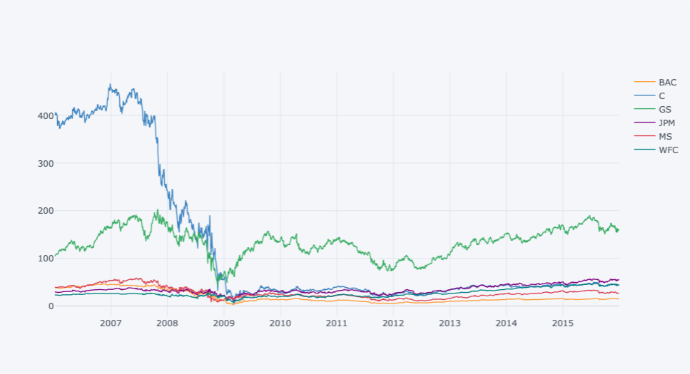
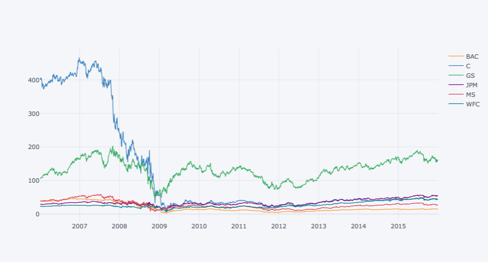
This project analysis how did the finance sector stocks performed before, during and after 'The Great Recession' from 2006 to 2016.In this project I analyzed 6 big banks Stock in the US before, during and after 'The Great Recession'. The banks are as below:
- JP morgan Chase (JPM)
- Bank Of America (BAC)
- Citi Group (C)
- Morgan Stanley (MS)
- Goldman Sachs (GS)
- Wells Fargo (WFC)
Steps Involved:1.Getting the Data from the web
2.Cleaning the Data
3.Using Pandas to manipulate data
4.Exploratory data analysis
5.Using matplotlib and Seaborn to visualize the data
6.Using Plotly and Cufflinks to create interactive and visually appealing plots
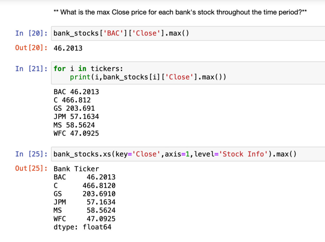
CODE AND PLOTS:
Max close price for each bank's stock
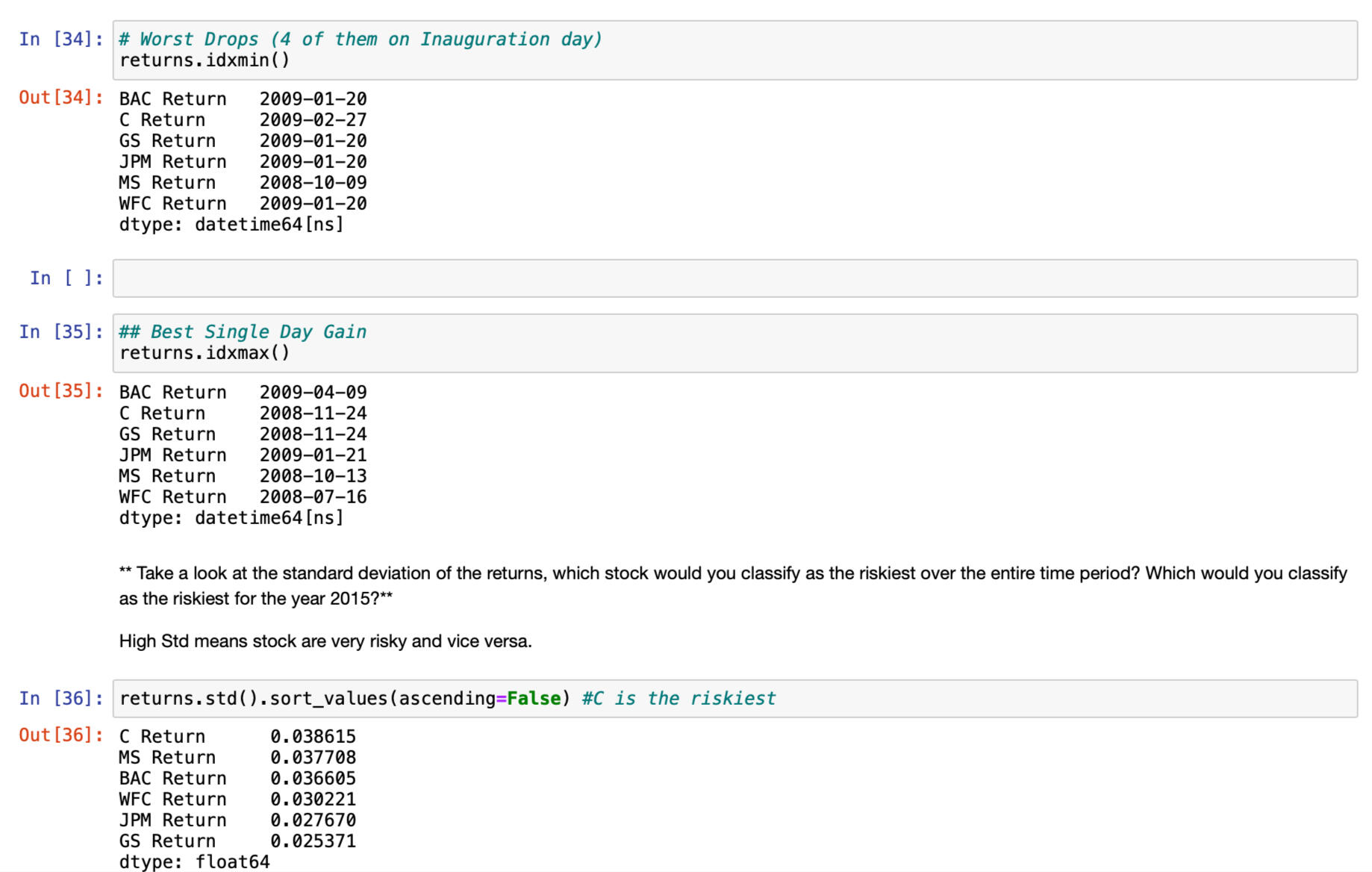
Each bank stock best and worst single day returns DATE
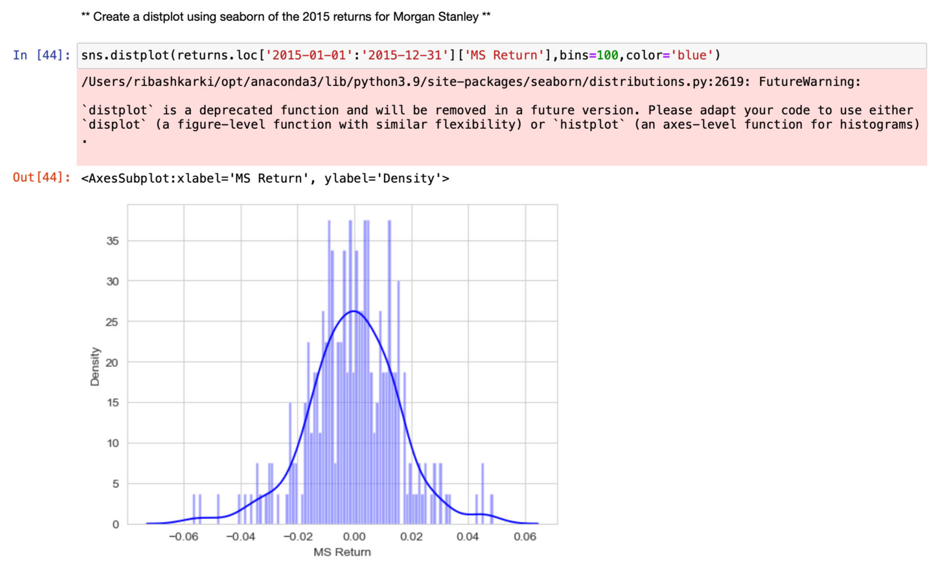
Distplot using seaborn of the 2015 returns for Morgan Stanley
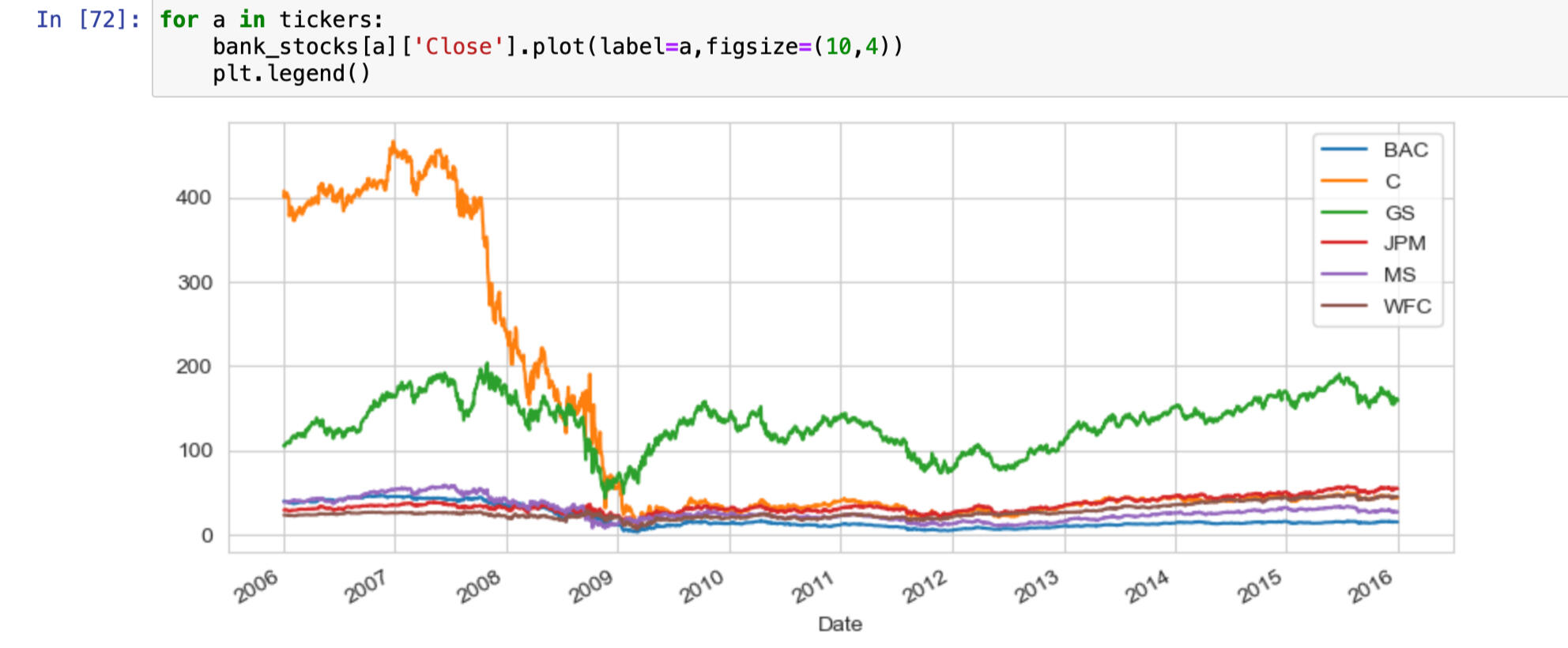
Lineplot showing close price for each bank for the entire index of timeline.
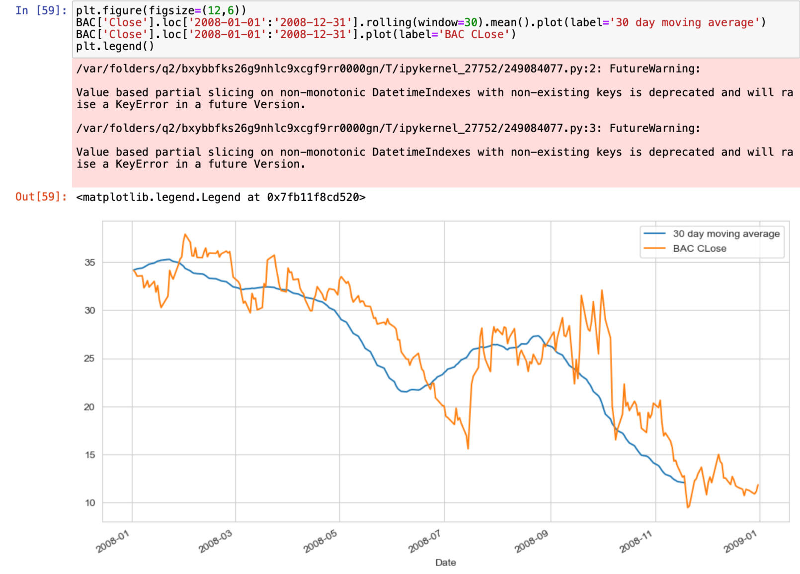
30 day moving average
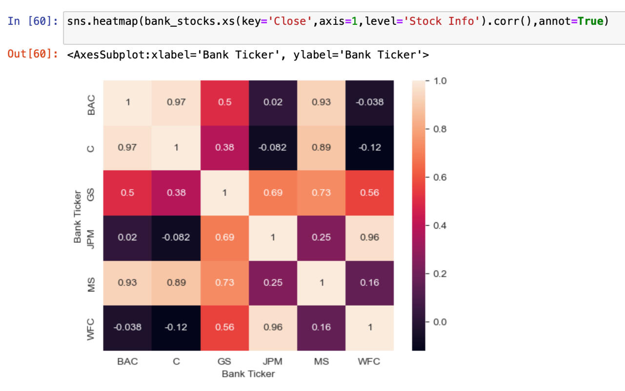
Heatmap of the correlation between the stocks Close Price
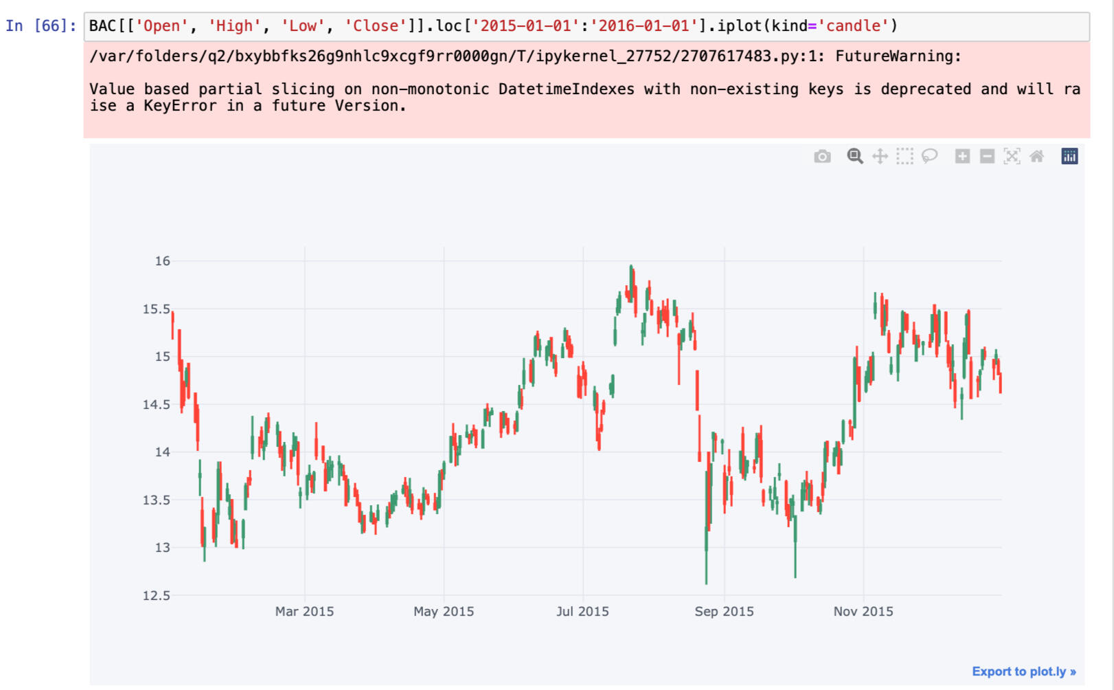
Candle plot of Bank of America's stock from Jan 1st 2015 to Jan 1st 2016
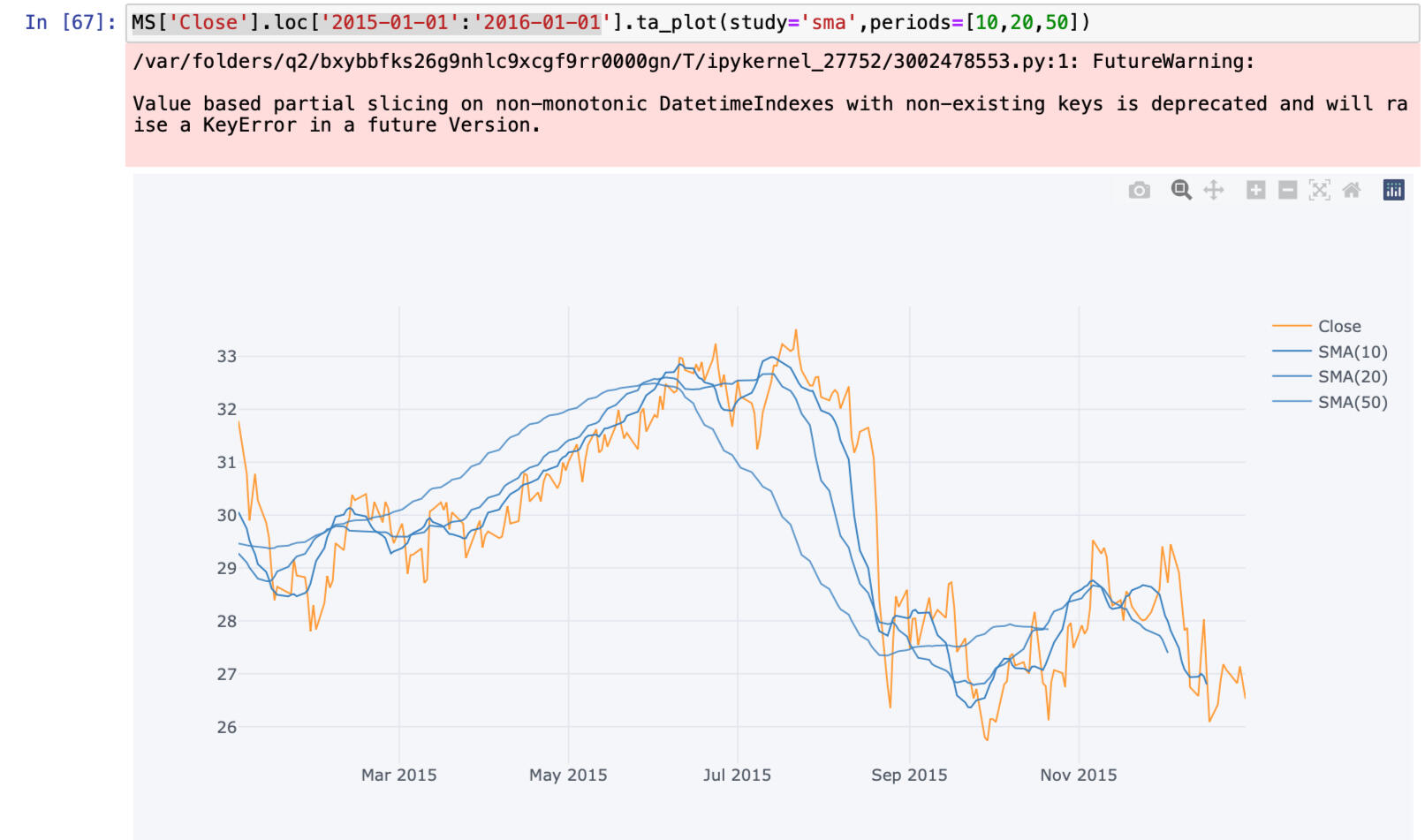
Simple Moving Averages plot of Morgan Stanley for the year 2015
You can click the link below to view the project.
CONTACT ME
© 2022 Ribash Karki. All rights reserved.

In this project I used a dataset from Kaggle.com to analyze the 911 calls. The steps involved in this projects are:
1. Getting the data
2. Loading the CSV file
3. Cleaning data
4. Manipulating data
5. Creating new columns
6. Analysis of data
7. Plotting different charts and lines
CODE AND PLOTS:
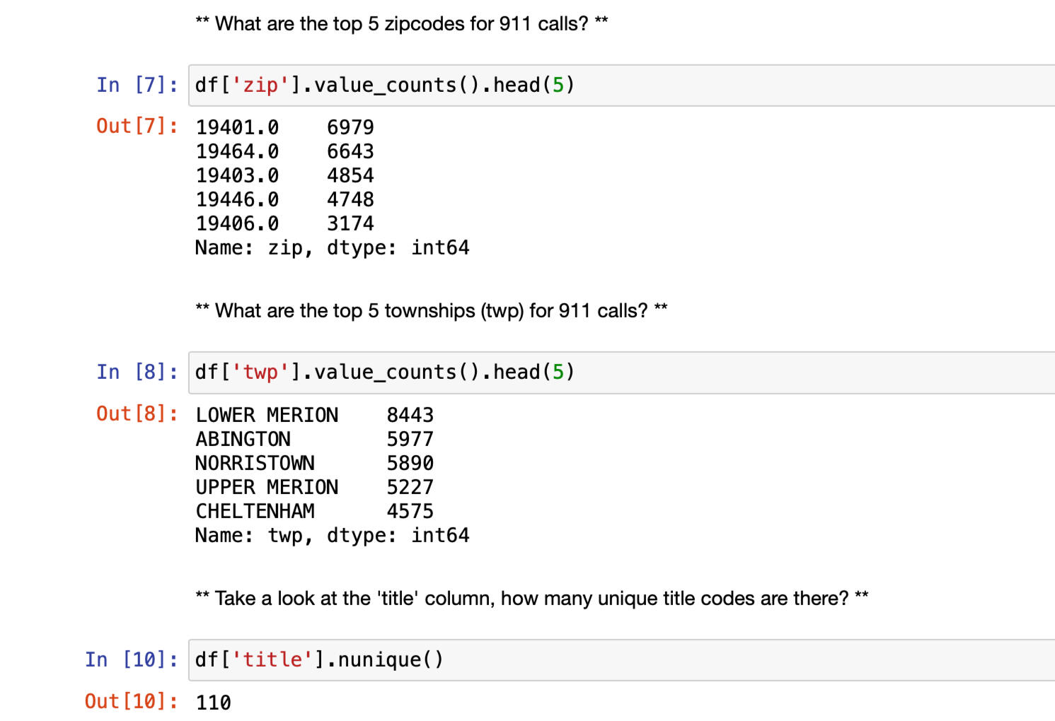
Top 5 zipcode and township for calls
Creating new columns to seperate same values
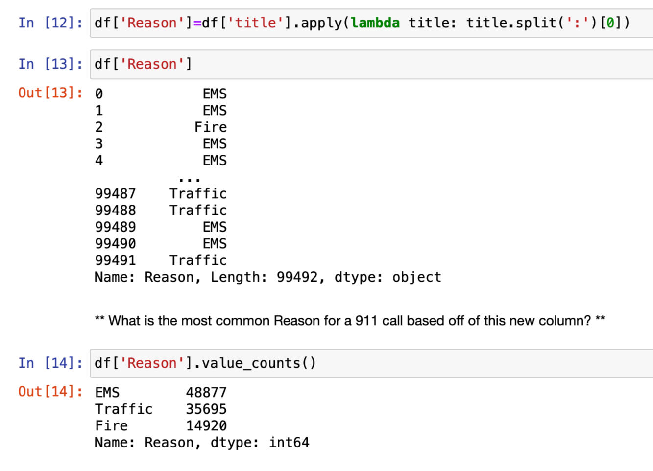
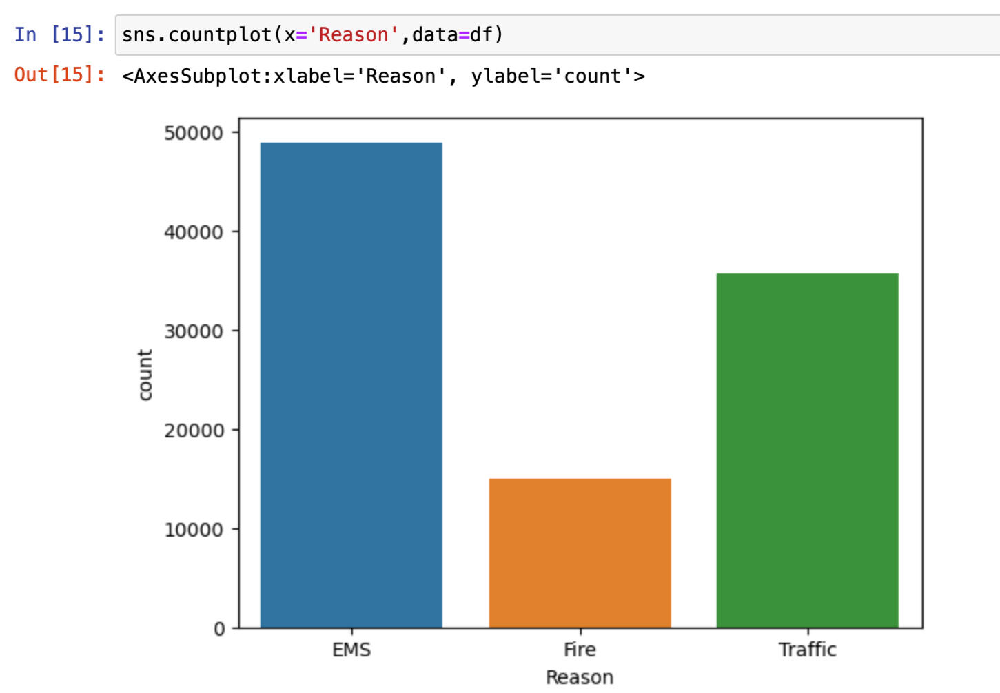
Using Seaborn to create countplot of 911 calls by Reason
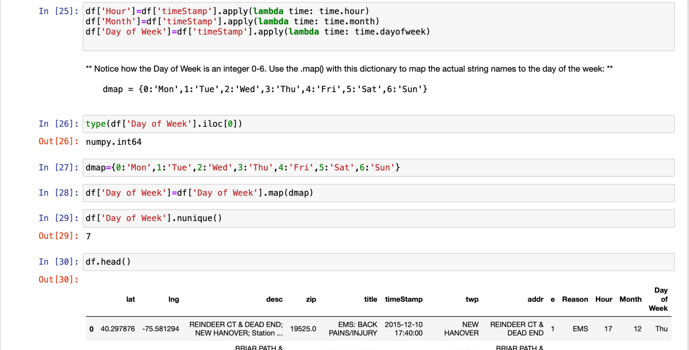
Spliting Timestamp into colums hour, month and day of week for detail analysis
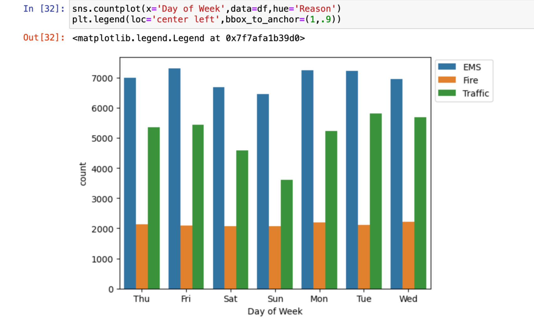
Countplot of the Day of Week column with the hue based off of the Reason column
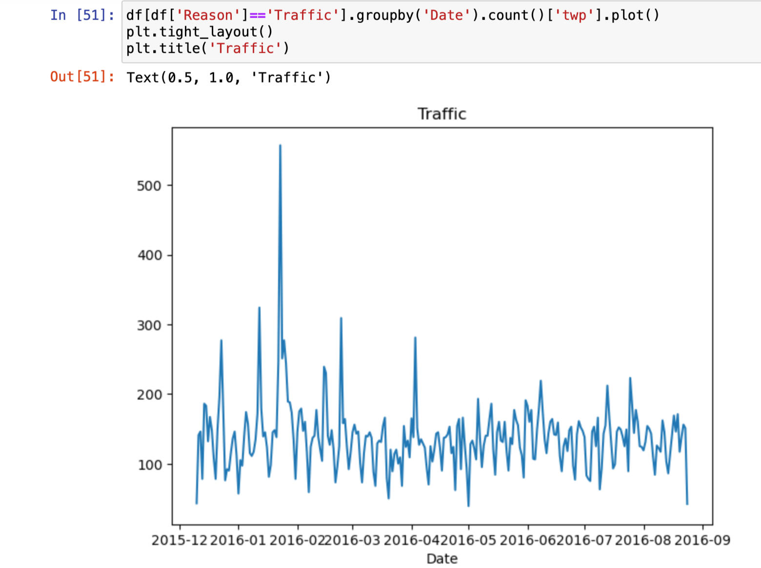
Plot that represent Traffic Reason for the 911 call
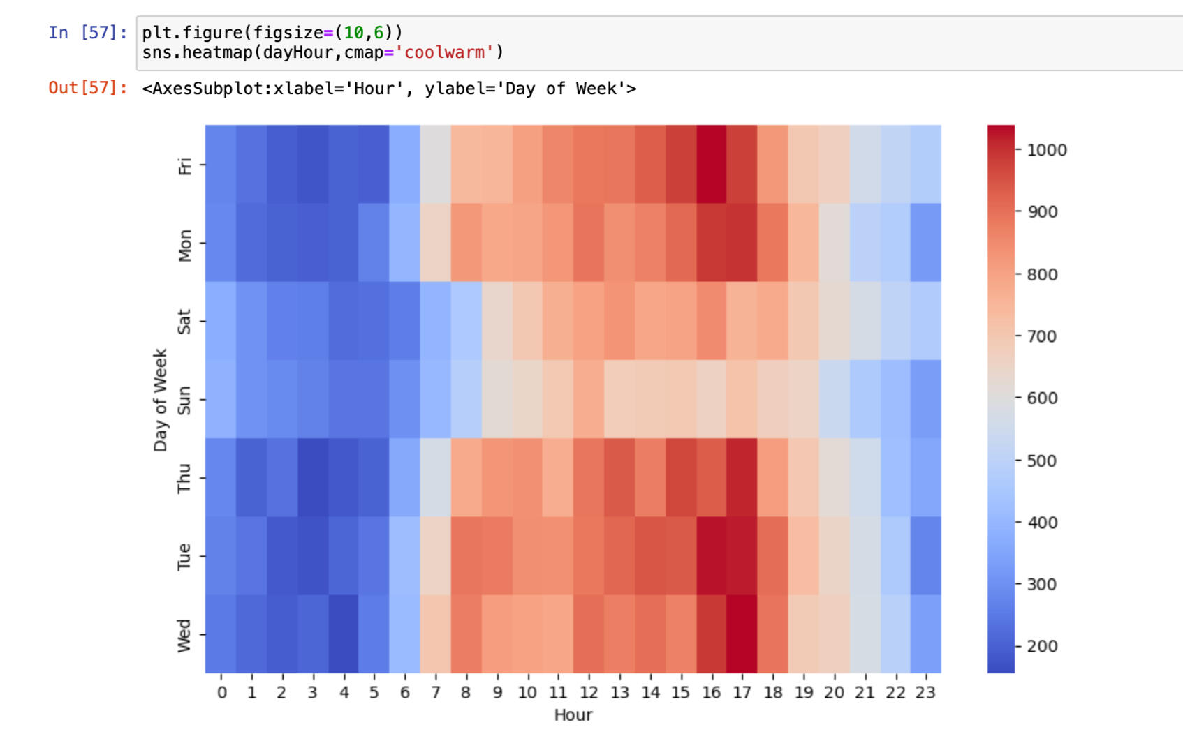
Heatmap based on hours
You can click the link below to view the project.
CONTACT ME
© 2022 Ribash Karki. All rights reserved.